Proven Squarespace Designs
for Growing Brands
Squarespace Websites That Work for Your Business
A good website does more than look professional. It brings the right people to your door and gives them a reason to get in touch.
Here's how three businesses made that happen:
MKLC Training went from invisible on Google to 800 monthly clicks — and 26 potential students finding them every single day
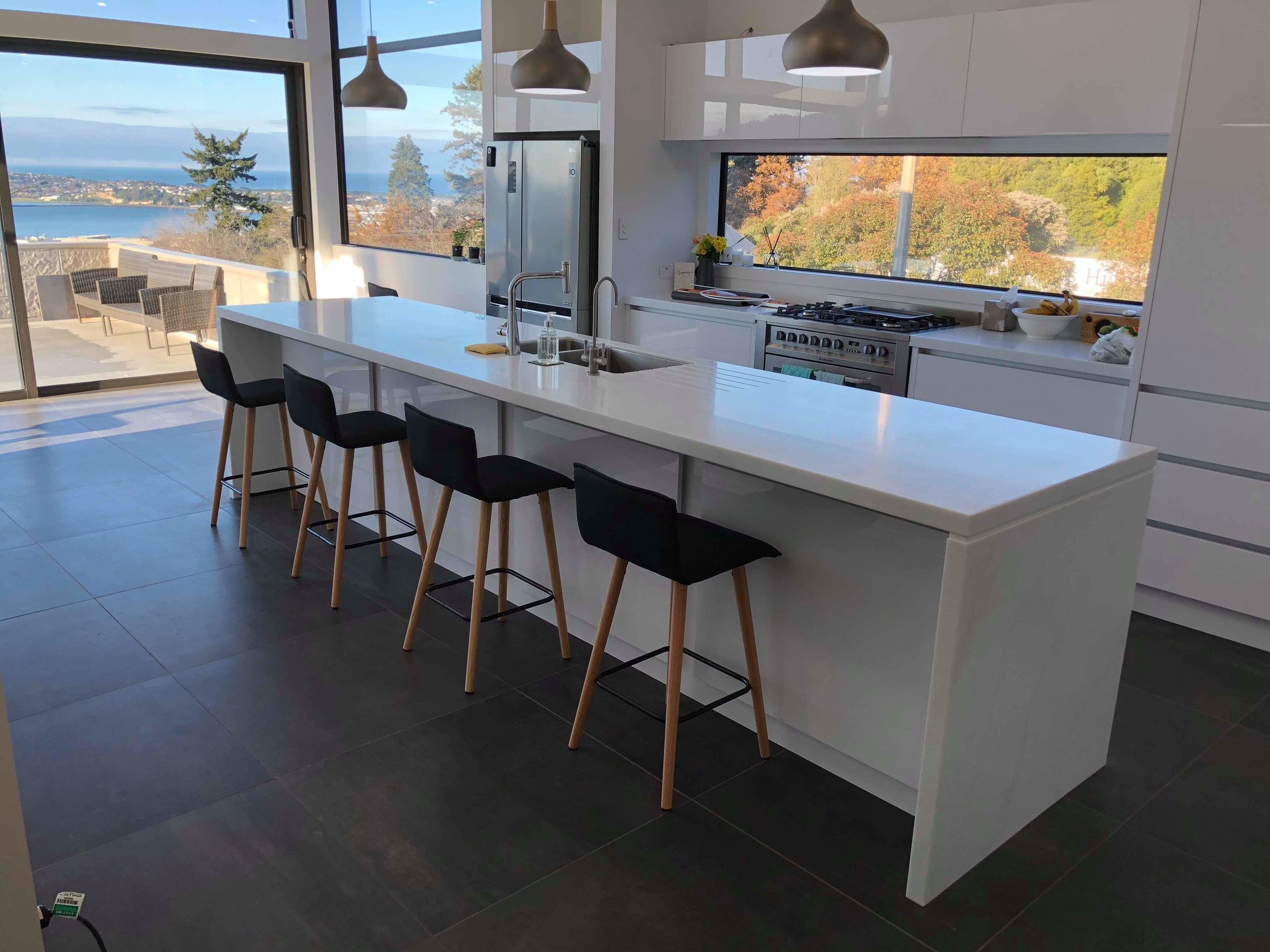
McGrath Benchtops filled their project calendar during their quietest month, picking up 100+ Google clicks in just 28 days
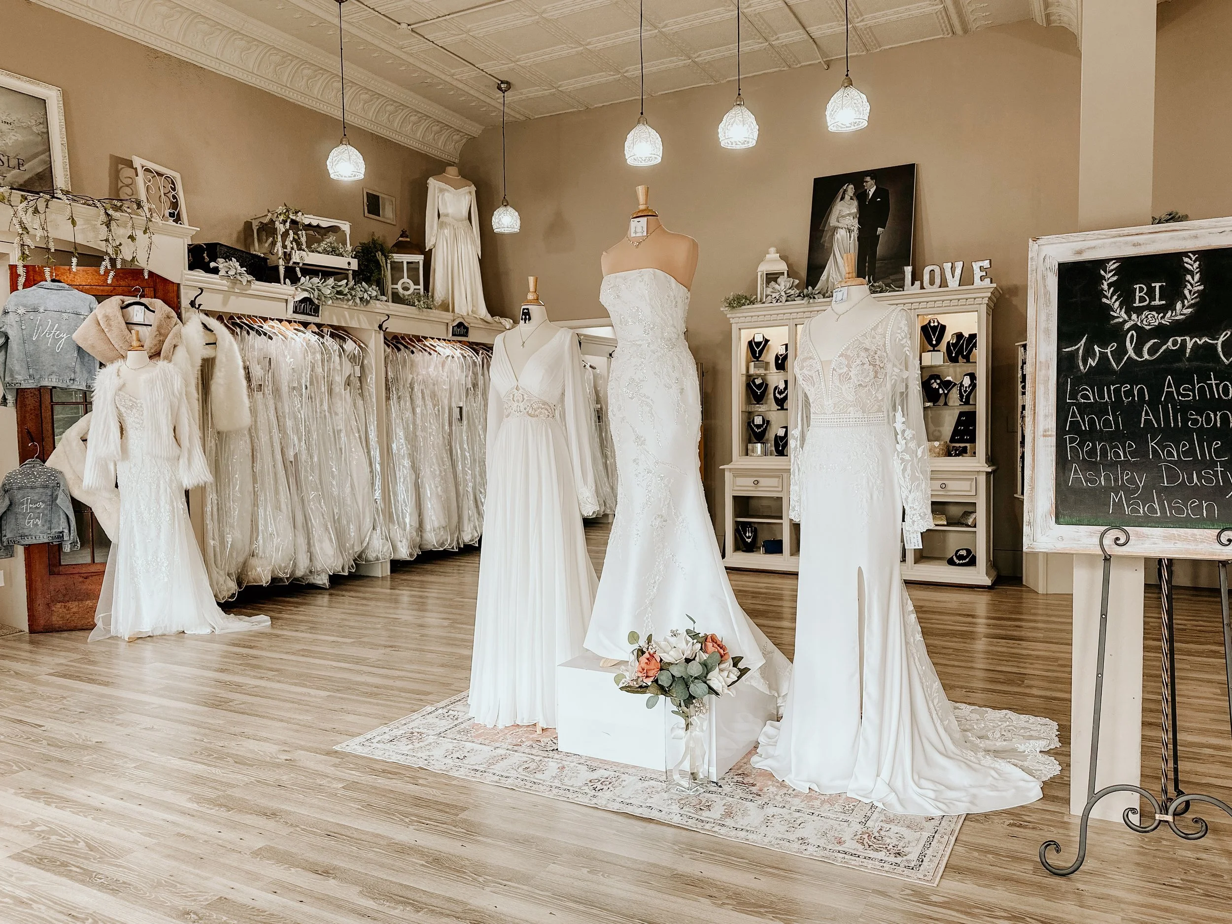
Bridal Isle attracted 17,000 unique visitors after a redesign that finally matched the warmth and elegance brides experience in store
Each case study walks you through the challenge, the approach, and the results — so you can see exactly what's possible for your own business.