Learnt Lately
Georgia rebranded her company for 2020, and wanted to update her site to include new content, showcase previous work, and explain her services clearly.
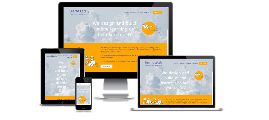
This was a fantastic creative challenge for Hot Lizard Designs, as although most of the general content was already on Georgia's site, in terms of creative direction, there was a business card, some line drawings, and the overall concept of a paper aeroplane representing 'flow, creativity, and design'.
HLD chose the yellow as the accent colour, as the colour is not only eye-catching, but also represents creativity, optimism and communication - ideal for the online learning services provided by Learnt Lately!
To make the user experience more accessible, large amounts of content were ‘hidden’ behind read more links that when clicked, would drop down and reveal more content (see screenshot).
The line drawings were made semi-transparent, and were set against a plain yellow background to make them more dynamic. The background image of clouds was inspired by the grey used in the business card design, and also introduces the concept of flying and freedom with creativity. With the parallax scrolling effect, it really gives the illusion of movement, and brings to life the creative vision that Georgia had with her rebranding concept.
“Hot Lizard Designs did a great job on my website. I was really happy with the end result and enjoyed working with Kati on the build process. I would recommend Hot Lizard Designs to anyone looking to build a Squarespace website.”

